Using dark mode has gained favoritism among some digital users. Social networks, websites and apps offer this option for consuming their content.
But with all this popularity, the question arises: is dark mode a synonym for healthy vision or just a placebo effect of a trendy aesthetic?
According to the digital solutions provider Creative’s Geniel, dark mode, also known as “dark theme”, will continue to be a popular option for 2023. And with its popularity comes various studies on the benefits and advantages of using dark mode.
But before delving into that, it’s interesting to understand how the dark mode began.

Dark mode and the first personal computers
In a simple way put, dark mode is a setting that changes the consumption of digital content from a light background to a dark background.
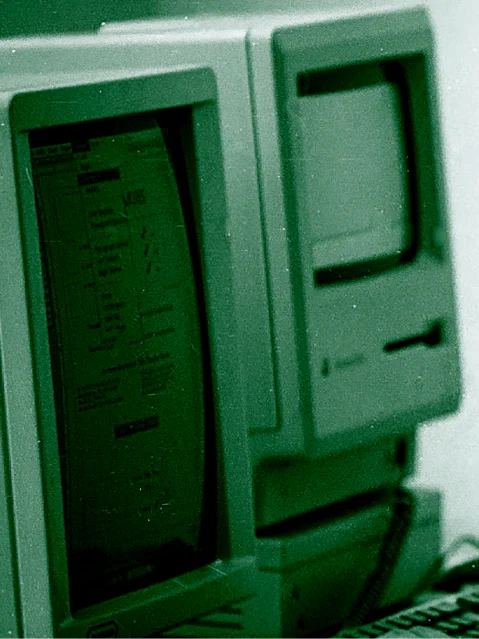
Interestingly, computers started, so to speak, in dark mode. According to Edward Vega, a video producer at Vox Media, he mentioned in an interview that the early computers used electron-illuminated phosphorus to display information on screens because of their ability to show only one color. As a result, screen backgrounds inevitably had to be dark. In the 1960s and 1970s, with technological advancements, the first computers capable of displaying colors emerged.
This was revolutionary and companies quickly switched from the monochromatic screens of the past to the colorful screens of the future, because the color is simply better. And with that came the first light modes."
According to Edward, another factor that contributed to the preference for light mode during that time was skeuomorphism: the idea that we find it easier to understand digital tools when they resemble their physical counterparts (for example: the word processing program compared to pen and paper). In other words, white surfaces with black text and information. This colorful world became a part of the digital experience since then.
But why, even with all the technological advancement in color displays, have we returned to using dark mode?
It helps to save battery
First of all, we can talk about saving energy. With online presence being necessary both personally and professionally, smartphones have become an essential tool in our daily lives. Therefore, it’s beneficial for devices to remain operational for extended hours.
According to the technology website Techspot, when dark mode is activated, devices with organic light-emitting diodes (OLEDs) essentially turn off the pixels on their screens, requiring less “light” to display content. As a result, less energy is expended and the battery is conserved.
And Techspot provides comparisons to prove the energy savings.
Google’s device consumes 250mA at maximum brightness in normal mode, while Apple’s phone had 230mA. In night mode at maximum brightness, however, the Pixel’s consumption drops by 63%, to 92mA."
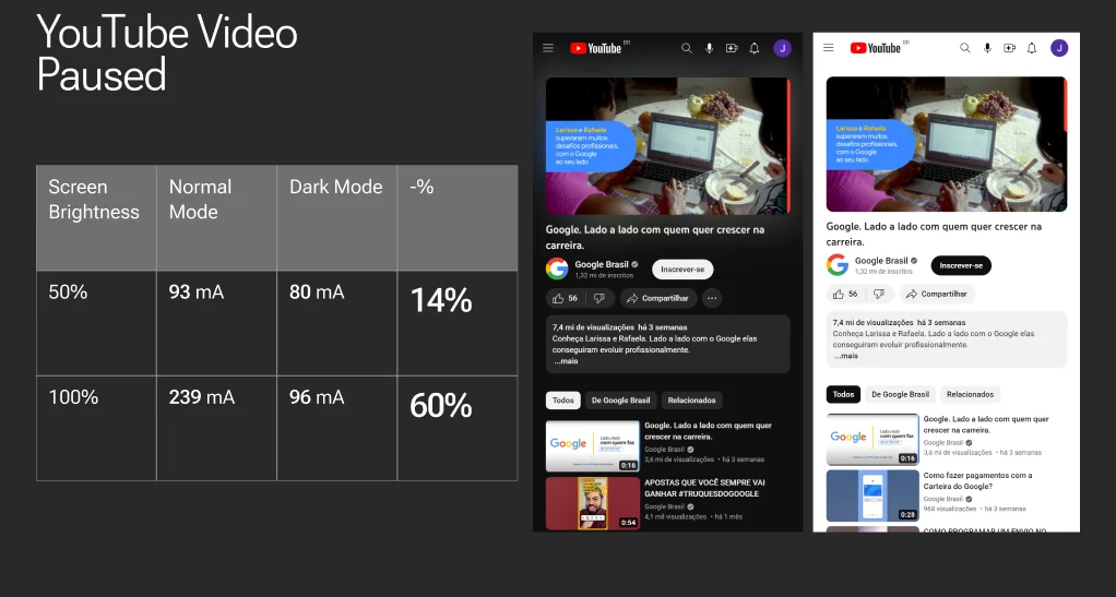
This percentage in battery conservation can also be seen on websites, such as the Youtube app. The online magazine Smashing Magazine claims that using 50% brightness on screens, dark mode saves up to 15% more screen power than on bright interfaces. At 100% brightness, dark mode can save up to 60% of screen power.

Reading comfort
Readability can also be positively affected by dark mode such as focus, light dispersion and contrast.
Visual focus is partly affected by the amount of light the eyes receive from the environment. In bright places, the pupil tends to contract to avoid glare and allow everything to come into focus. However, when the environment is dark, the pupils dilate to allow more light in. In these cases, dark mode is important because it simulates the same light intensity as the surrounding environment, emphasizing visual elements such as images.
Optometrist Antonio Hong explains that human vision has a natural predisposition to identify bright objects against a dark background. For example, it’s easier to spot small stars in the night sky than it is to find an airplane on a clear day. He also comments that using the dark mode at night, when the eyes are already used to low light, is more comfortable for the vision, as it avoids the annoying glare caused by white screens and can even help induce sleep, especially for those who check social media before bedtime.
It’s interesting to note that dark mode is not simply the implementation of a 100% black background contrasting with 100% white content. In fact, creating layouts in this way generates high contrast which, in turn, generates light dispersion, a glare effect around white letters that dazzles and makes reading difficult.
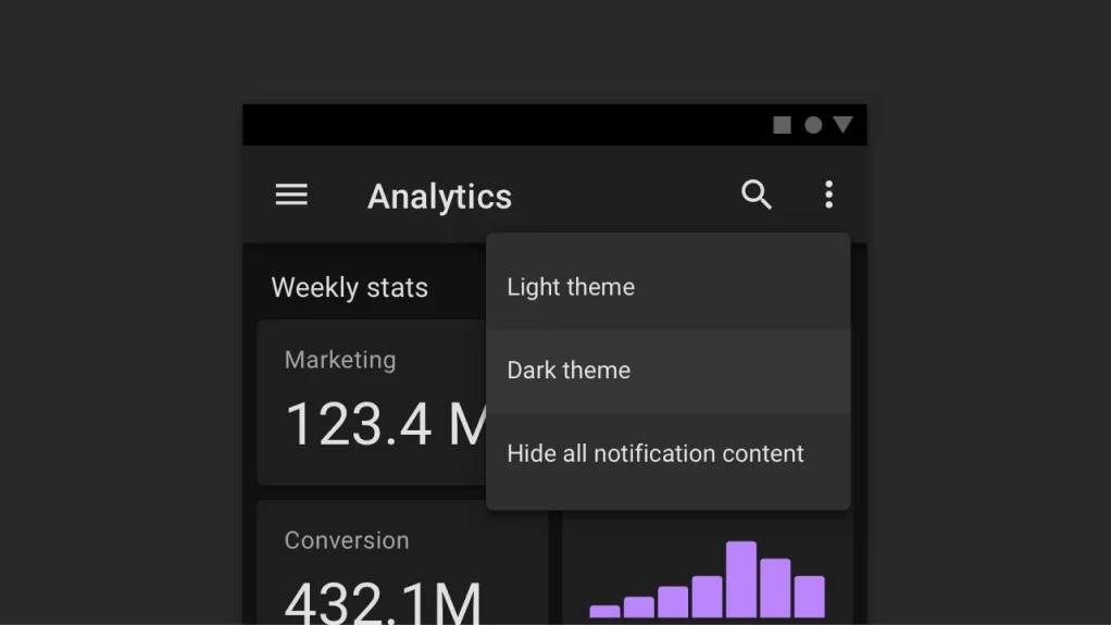
Based on Google Material Design, using shades of dark gray instead of 100% black ensures greater depth, elevation and breadth of colors that can be used, thus enabling an intuitive layout for the user and avoiding the scattering of light caused by the letters.
Finally, there’s the health aspect. When the first computers became part of the domestic environment, visual discomfort was not perceived, as most users did not spend much time in front of monitors. But nowadays, with the use of computers being necessary in most professions, we look at the screen all the time. This has led to ocular health issues, with eye strain being one of the most common, as claimed by the ophthalmologist Mario Cesar Diegues.
Is dark mode superior when it comes to digital work?
Putting together the information and observations shown above, we can see that the correct answer it is not about the use of one particular type of screen mode (light or dark) but rather to adapt to the specific needs.
In situations where focus is required for a long period of time and with large amounts of text, light mode can be advantageous, such as when writing a text on paper during the day. In cases where the emphasis is on images with short texts, or where it is already night time, dark mode can be used without problems, as the eyes have already become accustomed to the night time environment.
Google Material Design mentions this ease of reading: “dark gray surfaces also reduce eye strain, because light text on a dark gray surface has less contrast than light text on a black surface.”

The time of day can also be taken into account. Using the computer during the day, when everything is lit up, light mode can be interesting, just as dark mode is more effective at night, when we will have already begun to adapt our sight to the night environment.
There are other eye diseases that can benefit from dark mode. Product designer Jahde Vaccaci comments in her article on how people with different degrees of dark-sightedness can find the desired contrast in dark mode to see more easily. Jahde also recounts her own experience as a person with astigmatism: “the platform is too white for those with astigmatism like me, it gives me immense discomfort, my eyes are burning while I’m watching the lectures.”
At last, we must also remember that the exposure time in front of the computer is just as important as the screen mode used. The eye is an organ like any other, so it needs rest to function properly.
Doctors recommend the 20/20/20 technique: 20 minutes of work with a 20-second break looking at 20 meters. They also recommend, for those who wear glasses or not, the use of glasses with blue lenses, which block the blue waves coming from the screens and help maintain sight health.
It’s worth remembering that each eye is unique, so it’s also up to the user to understand whether the screen mode is comfortable or not.
Whether you like a lighter screen or prefer to look like a hacker from the movies who only uses dark screens, it would be interesting to look for the middle path. Look for a balanced use that allows your eyes to rest!

